
Ever since I was a fan of medieval Illustrated manuscripts (10th to 15th century), mostly the Limbourg Brothers (14th century), I have been interested in their use of perspective and buildings and architecture. I've played with this a little bit in the past, and now think I'm going to try to delve a little bit deeper.
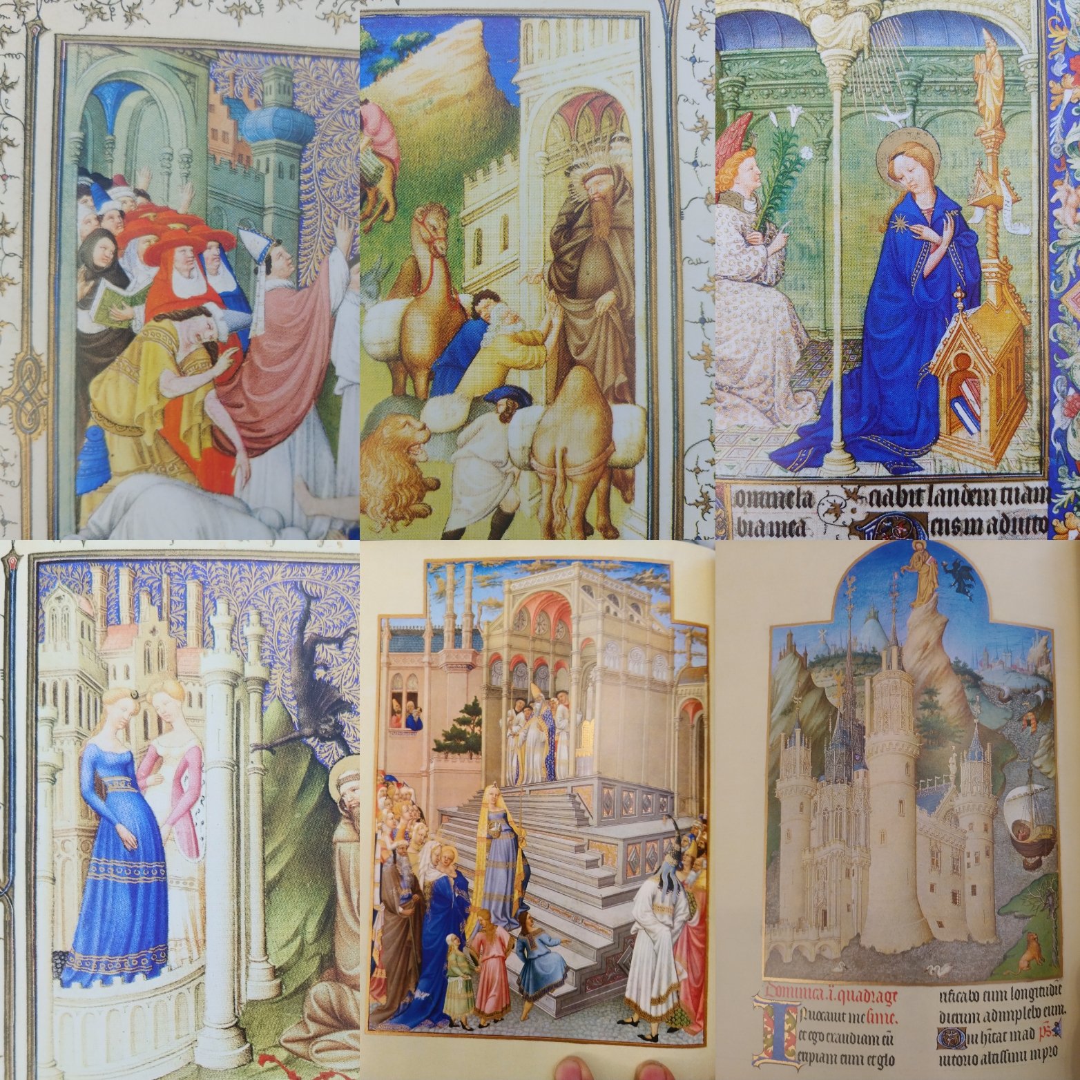
So these are just some of the paintings I pulled out of my two illustrated manuscripts books, but just LOOK at how crazy the perspective on the buildings is!! Nuts, right?! But somehow also pleasing…
I read somewhere once that before the 16th century’s wide adoption of central/convergent/linear/single/double -point perspective (like Brunelleschi’s dome and like EVERYTHING you see nowadays), in which an artist attempts to make the picture look like a vista as seen through a window; what they used to do is try to make representations look like they were popping out at you (isometric/empirical -perspective). So, rather than having buildings diminishing towards the horizon line, things are kinda popping out all crazy, kind of like those ‘exploded diagrams’ that engineers make sometimes.
Having never been a fan of paintings or drawings made by taking a photograph and projecting it on the canvas and tracing (it never looks good because people have binocular vision, i.e. two eyes, and a camera only has a single ‘eye’ or lens), and having always worked from life, now I’m wondering if I can take a new direction, but even less traditional. Like, I want to create a series of paintings that are still Hamtramck Houses, but look cooler.

This was just a set of sketches I did quick and dirty with a highligher and pen to try to figure out how to place the houses, how much to skew them, etc. BUT, I ended up liking it better than the two examples below which are from full-color paintings I’ve done in the past….

These are two the cityscapes from two paintings that I did about ten years ago: the top one is definitely more effective (I think because I put everything more consistently along the bottom horizon line, but I still prefer the two-color approach like the orangey one I did in PS and posted very first.
So, yeah, I don’t know where this will go but I’m gonna try to ‘cook’ on it and come up with some ‘best practices’ for utilizing pre-15th century perspectives in some new paintings….